Generally, the sports industry is constantly evolving for the football industry. As a result, new decisions that will benefit the industry have to be made. one such decision could be a change of logo. In this article, we shall examine why La Liga changed its logo.
What you need to know about La Liga
Before proceeding to know why La Liga changed its logo, it’s best to know a bit about La Liga.
La Liga, formerly known as La Liga Santander, is a professional football league in Spain. It is one of the most successful and competitive leagues in the world, consisting of about 20 clubs in the league. FC Barcelona and Real Madrid are the two most successful clubs in the league and also rivals to each other. La Liga has also produced some of the world’s best players in football history.
Some of these players have affiliations with other teams that are not registered under La Liga. Individual clubs that participate in La Liga may have contracts with FIFA regarding the registration and release of players for international competitions like the World Cup or continental tournaments such as the UEFA Champions League.
In this case, a contract has to be signed by both leagues in accordance with the release of a player.
Reasons Why La Liga Changed Logo
After much research, a few notable reasons have been drawn up as to why La Liga changed its logo. These reasons are better explained below.
1. Due to the end of a contract
At the start of the 2016/2017 season, the Spanish banking agent known as Banco Santander signed a sponsorship deal with La Liga, hence its former name, La Liga Santander. The giant Spanish banking agent has acted as the league’s primary holder after taking over from their previous sponsor, BBVA.
Moving forward, La Liga is grateful for the deal time spent with Santander and will not be renewing their contract, as it is time for a change. This change entails different forms, one of which is why La Liga changed the logo.
2. Marking of a new sponsorship deal
La Liga has marked its new sponsorship deal with a rebrand of its image and of its in-game graphics, as they begin a deal with EA Sports. EA Sports are the makers behind the popular computer game ‘FIFA’, although having failed to reach an agreement with football’s governing body, will now rename the game series EA Sports FC.
The gaming giants EA Sports have swooped in to pen a €30 million-a-year deal which will run until the end of the 2027/28 campaign.
‘La Liga EA Sports’ will be the new name going forward for the top tier, with the second division given the name ‘La Liga Hyper motion’ – as a nod to the technology used in their games. The contract also includes the LaLiga esports series and the LaLiga Promises youth competition.
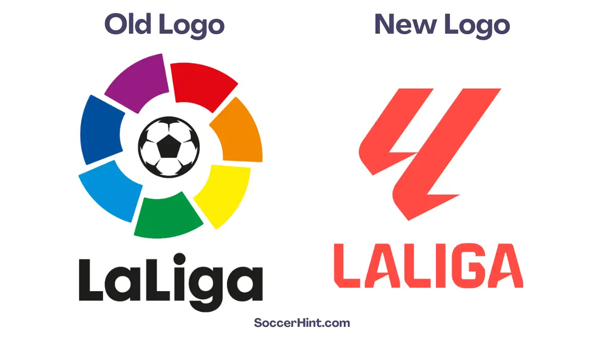
For the last 30 years, football fans have been accustomed to the La Liga logo which included the iconic multi-coloured wheel. However, ahead of the new season, the logo is set to be revamped.
According to Footy Headlines, the new logo will ditch the multi-coloured wheel and instead feature a pale red colour.
This logo will also feature the “LL” symbol which stands for “La Liga”. This is the first year of their new sponsorship with EA Sports, which will last for five years. A result of this new deal is why La Liga changed its logo.
3. To make the logo more modern
Another reason why La Liga changed its logo is to make it more modern and to present its values of innovation and change. As the world keeps evolving, different fields and industries are adhering to changes that will either “make or mar” them.
The football industry is not excluded in this line of change. The old logo was the multi-coloured wheel. I personally feel the logo was representing a lot. Some odd comments in previous articles portrayed the logo as being a representation of the LGBTQ community.
The new logo reveals a pale red wheel, which calls for less concern and looks more advanced than the previous stale and boring logo.
4. Rebranding Purpose
The purpose of rebranding shed light on an already existing brand. One of the reasons why La Liga changed its logo is to build its brand and expand globally, judiciously utilizing this new sponsorship deal.
Conclusion
It has been established that the new season of La Liga begins with a new logo. The prominent football league La Liga has had a change in its logo for over 30 years. They went from a multi-coloured wheel logo to a single-coloured logo. Impressive!
This change is mainly a result of their new sponsorship deal with EA Sports, the gaming giant of sports in the world. This deal came with a lot of changes to the famous football league, including why La Liga changed its logo. The new logo is said to feature the “LL” symbol, which stands for La Liga. what an innovative idea!


